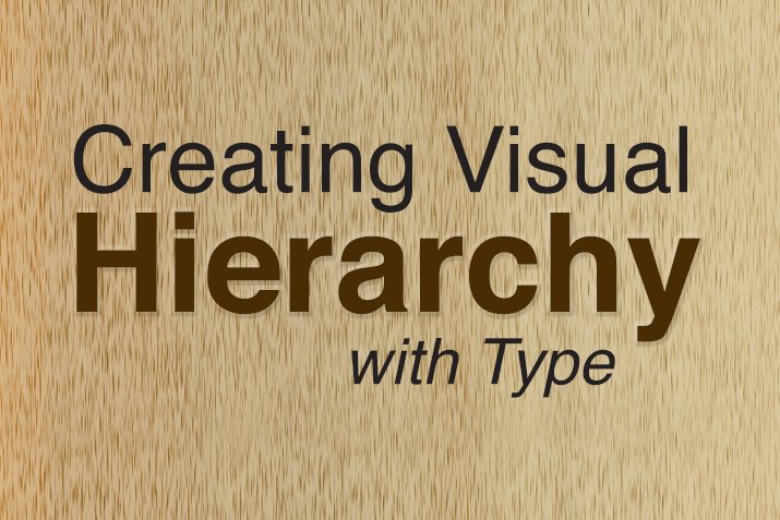
In the world of design, visual hierarchy is the key to creating engaging and effective communication. Typography, the art of arranging type, plays a significant role in achieving this hierarchy. In this blog post, we will explore how typography can be used to establish a compelling visual hierarchy and elevate the impact of your designs.
Understanding Visual Hierarchy:
Visual hierarchy is the arrangement and presentation of design elements in a way that guides the viewer’s eye through the content in a particular order. It helps prioritize information, create emphasis, and direct attention to key elements. A well-executed visual hierarchy ensures that the most important messages are delivered effectively, making the overall design more appealing and memorable.
Choosing the Right Typeface:
Selecting the appropriate typefaces is the first step in establishing visual hierarchy with typography. Each typeface has its unique personality and characteristics, which can evoke specific emotions and set the tone for your design. Consider the following factors when choosing typefaces:
Contrast: Use typefaces that have a clear contrast in style and appearance to differentiate between headings, subheadings, and body text. For example, pairing a bold and impactful heading font with a clean and legible body font can create a striking contrast.
Readability: Ensure that the chosen typefaces are highly legible, especially for body text. Avoid overly decorative fonts that may hinder readability.
Consistency: Maintain consistency in typeface choices throughout the design to establish a cohesive visual identity.
Hierarchy through Font Size and Weight:
Font size and weight are powerful tools to establish visual hierarchy. Larger and bolder fonts naturally draw more attention and act as focal points in the design. Reserve bigger font sizes for headings and subheadings, while using smaller and lighter fonts for the body text. This creates a clear distinction between different levels of information and guides the reader through the content in a logical order.
Emphasizing with Color:
Color can be a valuable asset in establishing visual hierarchy with typography. Using color to emphasize specific words, phrases, or headings draws attention to essential elements. Ensure that the color choices align with your brand identity and complement the overall design. However, use color sparingly and purposefully, as an excessive use of color can create visual clutter and dilute the impact.
Whitespace: A Powerful Ally:
Whitespace, or negative space, is the often overlooked hero of visual hierarchy. Adequate spacing between elements allows the design to breathe and enhances readability. It provides a natural separation between different sections and ensures a clean and uncluttered appearance. Embrace whitespace in your design to create a sense of elegance and sophistication.
Alignment for Clarity:
Consistent alignment of typography elements improves the overall organization and flow of the design. Left-aligned text is the most common and easily readable, while center or right alignment can be used sparingly for specific design purposes. Use alignment to create a sense of order and structure within your design.