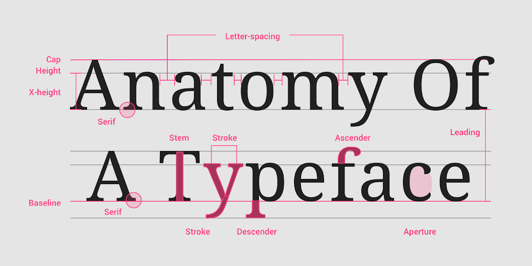
Typography is the art and skill of arranging and creating fonts to make written text aesthetically pleasing and readable. It is essential to many types of communication, including print media, web design, advertising, and graphic design. To produce functional and aesthetically acceptable designs, it is crucial to comprehend the fundamentals of typography, including fonts, styles, and hierarchy. Let’s examine each of these features in greater depth.
Fonts
Fonts are the distinct types of fonts’ styles and designs. Selecting the proper font is essential for effectively communicating the intended message since they may express a variety of moods, attitudes, and emotions. Here are a few typical font classifications:
Serif: Small ornamental strokes or lines appear at the extremities of characters in serif typefaces. They are frequently linked to a conventional, formal, and vintage look. Examples are Baskerville, Georgia, and Times New Roman.
Sans-serif: Sans-serif typefaces are devoid of ornamental strokes and have a contemporary, minimalistic appearance. They are frequently employed for digital media and give off a more relaxed, modern vibe. Arial, Helvetica, and Verdana are a few examples.
Script: Script typefaces give projects a refined, personalized touch by simulating cursive handwriting. Invitations, logos, and headlines frequently employ them. Examples are Pacifico, Lobster, and Brush Script.
Display: Display typefaces are eye-catching, ornamental, and appropriate for headings or titles. They come in a range of designs, from elaborate and artistic to bold and eccentric. Impact, Stencil, and Broadway are a few examples.
Monospaced: Character widths in monospaced typefaces are fixed, giving them a unified appearance. They are frequently employed in typewriter-style designs and code. Consolas and Courier New are two examples.
Styles
Different typographic styles are available to improve the readability and aesthetic attractiveness of text. Some common styles include:
Bold: Bold fonts are heavier and darker, which highlights the text. They are frequently employed as headers, subheadings, or accents.
Italic: Italic typefaces, which seem slanted, are frequently employed to emphasis or highlight particular words or phrases within a body of text.
Underline: Once often employed to emphasize text, underlining is now largely avoided in professional design since it might confuse hyperlinks.
Strikethrough: A line through text is used to suggest deletion or to convey a feeling of revision or alteration.
All Caps: The impact and prominence of text can be increased by using all capital letters. However, it’s important to use this carefully since overuse of capitalization can make text hard to understand.
Hierarchy
Hierarchy in typography refers to the arrangement and organization of different typographic elements to create a visual structure that guides the reader’s eye through the content. It helps establish a clear information hierarchy and emphasizes important information. Some techniques to establish hierarchy include:
Size: Larger text naturally attracts more attention, so using different font sizes for headings, subheadings, and body text can create a visual hierarchy.
Weight: Bold or heavier fonts can make specific elements stand out and draw attention.
Color: Different colors can be used to differentiate between elements and create a sense of hierarchy. Brighter or contrasting colors can be used for important information.
Contrast: Contrast in size, weight, or style can create differentiation and establish a visual hierarchy.
White Space: Proper spacing and white space around elements help create visual separation and draw attention to specific areas.