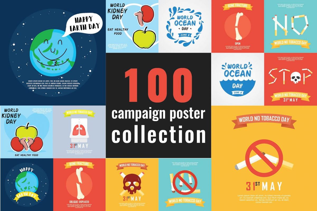
Designing a captivating poster involves considering various elements such as layout, color, typography, imagery, and composition. Here are some steps to help you design a captivating poster.

Define the purpose and message:
Clearly understand the purpose of the poster and the message you want to convey. Whether it’s promoting an event, showcasing a product, or raising awareness, a clear objective will guide your design choices.
Know your target audience:
Identify your target audience and consider their preferences, tastes, and demographics. This will help you tailor the design to appeal to them effectively.
Plan the layout:
Determine the overall layout and structure of your poster. Consider the hierarchy of information and prioritize the most important elements. Experiment with different arrangements to find a visually engaging composition.
Select a color scheme:
Choose a color palette that suits the mood and theme of your poster. Use colors strategically to create visual impact and evoke the desired emotions. Ensure that the colors harmonize well and create contrast where needed.
Typography:
Select appropriate fonts that align with the message and theme of your poster. Consider readability and legibility, and use font variations (such as bold, italic, or different sizes) to emphasize key information. Experiment with different typography combinations to create visual interest.
Use compelling imagery:
Incorporate visually appealing and relevant imagery that supports your message. High-quality photographs, illustrations, or graphics can capture attention and convey the essence of your poster. Ensure that the images are clear, well-positioned, and do not overwhelm the overall design.
Balance and hierarchy:
Create a sense of balance and visual hierarchy within your design. Arrange elements in a way that guides the viewer’s attention and emphasizes important information. Use size, color, and positioning to establish a clear visual hierarchy.
Simplify and declutter:
Avoid cluttering the poster with excessive text or unnecessary elements. Keep the design clean and focused. Use concise and impactful messaging to convey your information effectively.
Experiment with composition:
Explore different composition techniques such as rule of thirds, symmetry, asymmetry, or grid-based layouts. Experiment with different placements of elements and negative space to create visual interest and balance.
Test and iterate:
Once you have a design, seek feedback from others and consider their suggestions. Make any necessary adjustments or refinements to improve the overall impact and effectiveness of the poster.