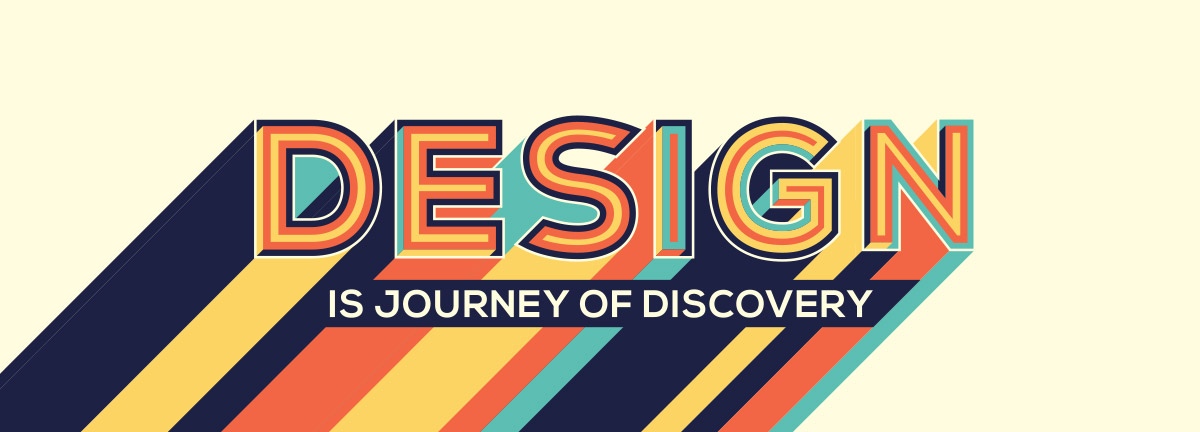
Using typography effectively in design is crucial for conveying messages, setting the tone, and creating a visually appealing composition. Here are some key tips on how to make the most of typography in your design.

Choose the Right Typeface:
Select a typeface that aligns with the overall style and message of your design. Consider factors such as readability, legibility, and appropriateness for the intended audience.
Establish Hierarchy:
Use typography to create a clear visual hierarchy in your design. Assign different levels of importance to different elements by varying font sizes, weights, and styles. This helps guide the viewer’s attention and organizes the information effectively.
Contrast and Balance:
Create contrast between different typographic elements to make them stand out and add visual interest. Contrast can be achieved through variations in size, weight, color, and style. However, also strive for balance and ensure that the typographic elements harmonize with each other and the overall design.
Consider Readability:
Prioritize readability by choosing fonts that are easy to read at different sizes. Pay attention to spacing between letters (kerning), words (tracking), and lines (leading) to enhance legibility. Avoid excessive decorative fonts or excessive use of special effects that may hinder readability.
Use Hierarchy to Organize Content:
Structure your text using headings, subheadings, and body text to guide readers through the content. Headings should be larger and more prominent, while body text should be legible and comfortable to read. Maintain consistency in the use of typography throughout the design.
Align and Space Text Thoughtfully:
Ensure that text is aligned properly within your design. Aligning text to a grid or other design elements creates a sense of order and cohesion. Additionally, consider the spacing between lines, paragraphs, and elements to create a visually balanced layout.
Experiment with Typography:
Don’t be afraid to experiment and explore different typographic treatments. Play with different font combinations, sizes, and styles to find a unique and engaging look for your design. However, ensure that the experimentation doesn’t compromise readability or the overall design’s coherence.
Consider Cultural and Contextual Factors:
Keep in mind the cultural and contextual implications of typography. Certain typefaces and styles may carry specific connotations or have cultural associations. Be mindful of these factors and select typography that aligns with the intended message and audience.
By following these guidelines, you can effectively use typography as a powerful tool to enhance the visual impact and readability of your design, ensuring that your message is communicated effectively to your audience.