Color is a powerful tool in the world of art and design, and mastering the art of color mixing can take your creative work to the next level. Whether you’re a painter, a graphic designer, or a DIY enthusiast, understanding the principles of color theory and experimenting with various color combinations can lead to the creation of truly unique and visually striking palettes. In this blog post, we’ll explore some invaluable tips to help you elevate your color-mixing skills and create palettes that are both distinctive and harmonious.
Get to Know Color Theory
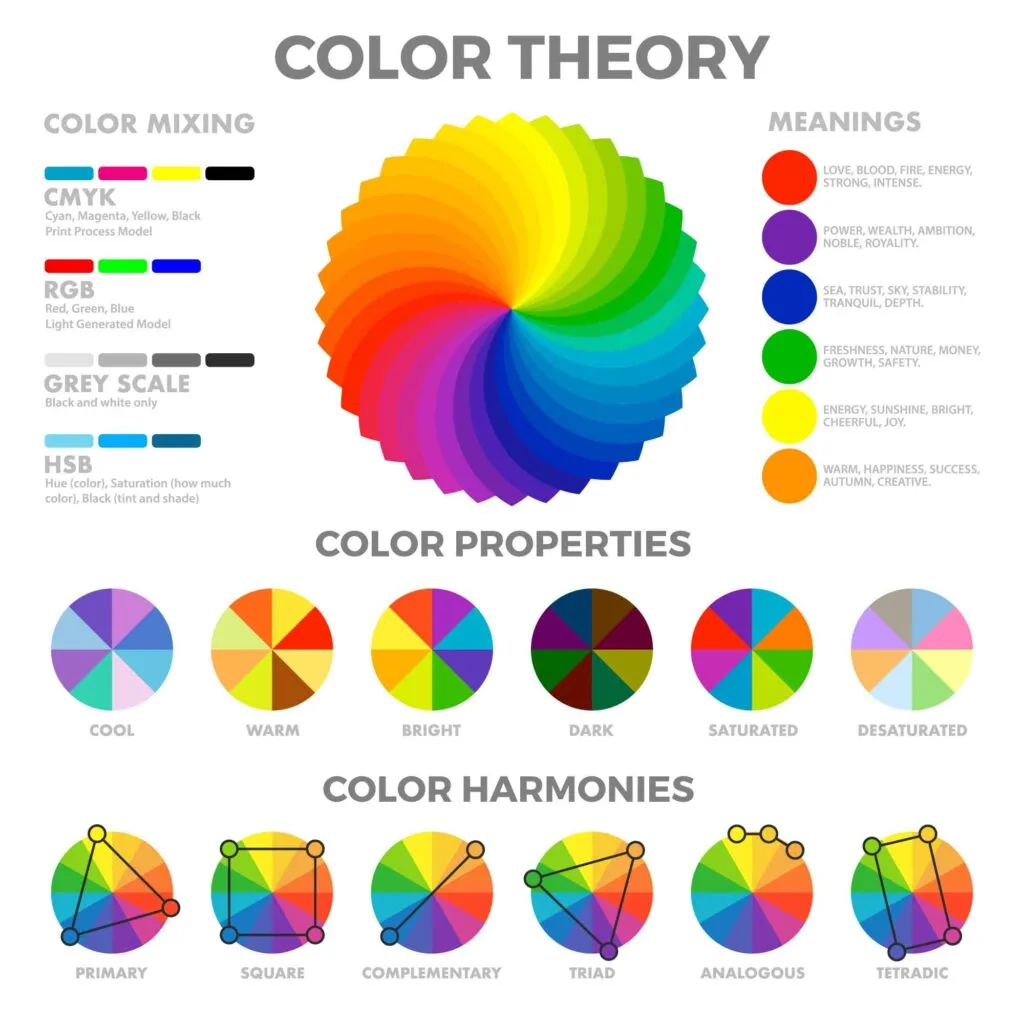
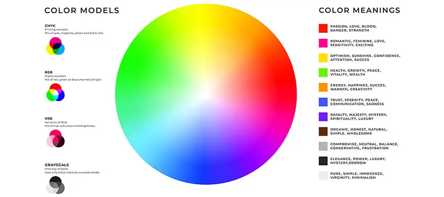
Before you dive into color mixing, it’s essential to understand the basics of color theory. The primary colors, red, blue, and yellow, serve as the building blocks for all other colors. Secondary colors are formed by mixing two primary colors, while tertiary colors are created by combining a primary and a neighboring secondary color.
Embrace the Color Wheel
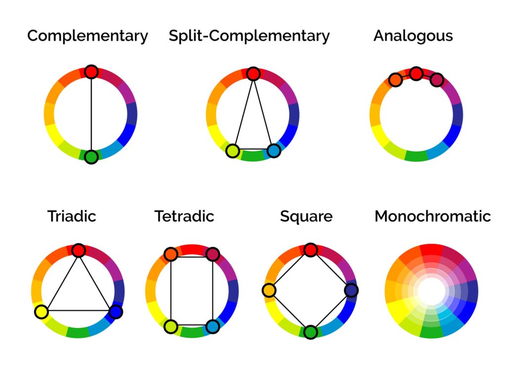
The color wheel is your best friend when it comes to color mixing. It visually represents the relationships between colors. Complementary colors are positioned opposite each other on the wheel and create striking contrasts when paired. Analogous colors, on the other hand, are adjacent to the wheel and provide a harmonious, blended effect. Explore these relationships to find unique palettes.
Experiment with Hue, Saturation, and Brightness
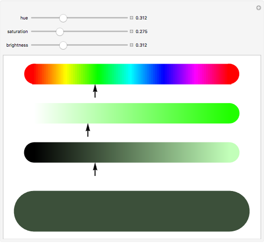
Hue, saturation, and brightness are the three key attributes of color. By adjusting these elements, you can create endless variations. Change the hue to explore different types of colors, adjust the saturation to make colors more or less vibrant, and vary the brightness to control the lightness or darkness of a color.
Play with Color Temperature
Colors can be categorized as warm or cool. Warm colors (reds, oranges, yellows) evoke energy and warmth, while cool colors (blues, greens, purples) create a calming and refreshing atmosphere. Combining warm and cool colors in your palette can generate dynamic contrast and visual interest.

Seek Color Harmony
Different color harmonies can guide your palette choices. Monochromatic palettes use shades and tints of a single color, while complementary and triadic palettes offer more striking combinations. Explore these harmonies to achieve the desired mood and effect in your work.
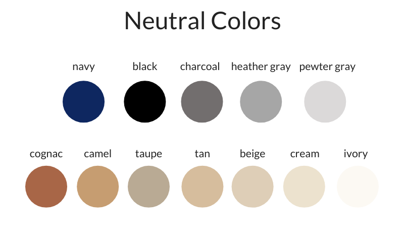
Balance with Neutrals
Don’t underestimate the power of neutral colors. Black, white, gray, and brown can serve as stabilizing elements in your palette. They tone down bright colors and provide a background for more vibrant ones, maintaining a sense of balance.
Consider Context
Think about the context in which your palette will be used. Different colors evoke specific emotions and associations. For example, blue is often associated with calmness, red with energy, and green with nature. Make sure your color choices align with the message or mood you want to convey.

Draw Inspiration from Nature
Mother Nature is a master colorist. Look to the natural world for endless inspiration. Observe the colors of sunsets, landscapes, and the intricate palettes of flora and fauna. Nature often combines unexpected but harmonious colors that can spark your creativity.

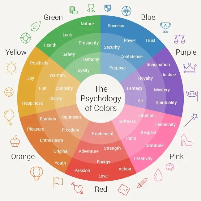
Use Color Psychology
Understanding the psychological effects of colors can help you choose the right palette for your project. Blue can be calming, red energizing, and green evoke growth and nature. Leverage these psychological cues to elicit specific emotions and reactions in your audience.
Test and Iterate
Don’t be afraid to experiment and make adjustments. Create color swatches, test them in your artwork or design, and refine your palette as needed. It’s through iteration that you’ll discover the combinations that truly resonate with your creative vision.

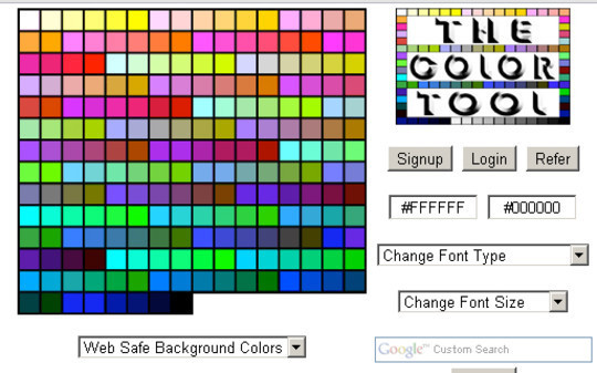
Digital Tools and Resources
In the digital age, you have a plethora of tools and resources at your disposal. Use color palette generators and design software to explore, fine-tune, and experiment with colors effortlessly.
Get Feedback
Sharing your work with peers, mentors, or even online communities can provide valuable insights and fresh perspectives on your color choices. Constructive feedback can help you see aspects you might have missed and refine your palette accordingly.
Keep a Color Journal
Maintain a color journal where you document your favorite color combinations and the inspiration behind them. This journal can serve as a valuable reference for future projects, ensuring your unique palettes are never forgotten.
Conclusion
The art of color mixing is a journey of exploration and self-expression. By understanding color theory, leveraging the color wheel, experimenting with hue, saturation, and brightness, and considering color harmony, you can create unique and captivating palettes that set your creative work apart. Remember, there are no strict rules in the world of color mixing – personal experimentation is the key to developing your unique style and making your artistic vision come to life. Whether you’re a professional artist or an amateur creator, the tips outlined in this blog post will serve as a valuable guide on your colorful journey.