In the world of design, there’s a secret weapon that has the ability to transform the mundane into the extraordinary, the unnoticed into the attention-grabbing, and the ordinary into the extraordinary: it’s the power of contrast. And at the heart of contrast lies color—the dynamic force that can make elements in your designs stand out like never before.
The Color Wheel: Your Design Compass
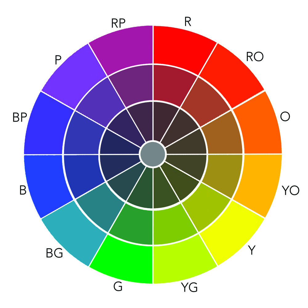
Before we dive into the intricate world of color contrast, let’s begin with the basics: the color wheel. This simple tool lays out the spectrum of colors in a circle, with primary colors (red, blue, and yellow) forming its core. As you move around the wheel, you encounter secondary and tertiary colors, each with its unique personality.
Complementary Colors: The Ultimate Contrast Makers
One of the most potent tools in a designer’s arsenal is the use of complementary colors. These are colors that sit opposite each other on the color wheel. Think of red and green, blue and orange, or purple and yellow. When placed side by side, complementary colors create a stark contrast, making each other pop in a visually arresting way. This technique is particularly effective when you want to draw attention to a specific element in your design.
Creating a Focal Point
Imagine a sea of blues and greens in your design. How do you make one element stand out? By introducing a color that contrasts sharply with the surroundings. A bright yellow or fiery red, strategically placed amidst cooler colors, instantly becomes the focal point. The human eye is naturally drawn to areas of contrast, so use this knowledge to guide your audience’s gaze to where it matters most.
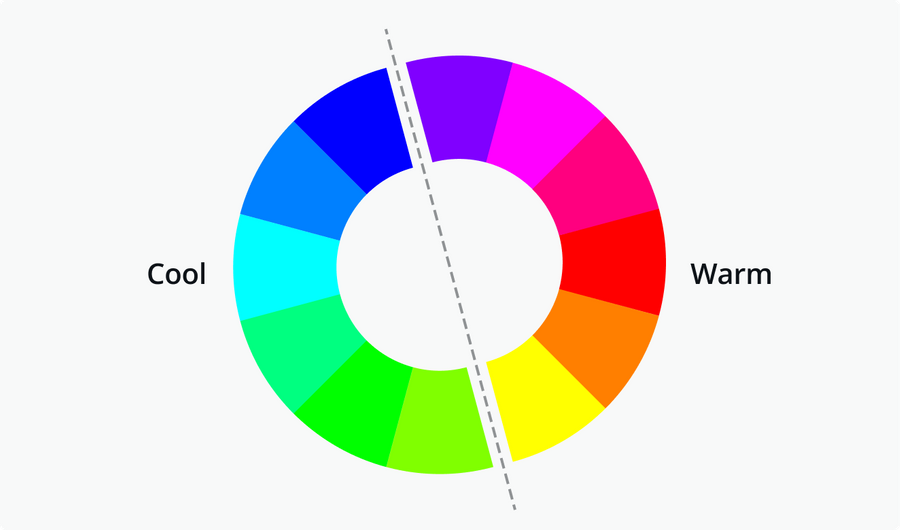
The Temperature Game: Warm vs. Cool Colors
Color temperature, the distinction between warm and cool colors, is another dimension of contrast. Warm colors (reds, oranges, yellows) radiate energy and excitement, while cool colors (blues, greens, purples) convey calm and serenity. Mixing warm and cool colors in your design can create a dynamic tension, making certain elements leap off the canvas.
Varying Saturation and Value
Contrast isn’t limited to the hue of colors alone. You can play with saturation (the intensity of a color) and value (the lightness or darkness of a color) to create a subtle yet effective contrast. Pairing a vibrant, highly saturated color with a muted, desaturated one can yield a harmonious yet visually captivating combination.
Accessibility Matters
While chasing contrast for aesthetics, don’t forget about accessibility. In web and print design, ensuring that text remains easily readable against its background is crucial. Maintaining a sufficient level of contrast between text and its backdrop is vital to inclusivity and effective communication.
Experimenting with Analogous Colors
Complementary colors aren’t the only way to create contrast. Analogous colors, those that sit next to each other on the color wheel, can also be used to great effect. Although they don’t create the same level of stark contrast, they provide a harmonious and pleasing color palette that can be ideal for certain designs.
Cultural Considerations
Color carries cultural associations and meanings that vary across the globe. Red may symbolize love and luck in one culture but signify danger or caution in another. Always be mindful of the cultural context when using color to convey emotions or messages.
Test and Iterate
The effectiveness of color contrast can vary depending on your audience and the specific context of your design. It’s wise to test your designs with real users and be open to making adjustments based on their feedback.
Balance and Harmony
In your quest for a striking contrast, don’t lose sight of the big picture. Achieving a balanced and harmonious overall composition is equally crucial. Strive for a design that not only stands out but also feels cohesive and visually pleasing.
In conclusion, the power of contrast in design, driven by the judicious use of color, is a superpower that every designer can harness. By mastering the principles of color theory, experimenting with different color combinations, and understanding cultural nuances, you can make your design elements stand out in a sea of visual noise. Remember, it’s not just about what stands out, but also how it all comes together to tell your story and convey your message effectively. So, let color be your brush, and let contrast be your canvas in the world of design.