In the realm of web design, aesthetics, and user experience go hand in hand. One of the fundamental elements that bridge the gap between these two aspects is typography. The choice of fonts, sizes, and styles can significantly impact how users perceive and interact with your website. In this blog post, we’ll delve into the best practices and considerations for leveraging typography effectively in web design.
1. Choose Readable Fonts:
When it comes to typography, legibility is paramount. Opt for web-safe fonts or popular web fonts like Arial, Helvetica, Times New Roman, or explore the vast library of Google Fonts. Ensure that your chosen fonts are easy to read across different devices and screen sizes.

2. Establish Hierarchy:
Typography helps create a visual hierarchy on your webpage. Make use of various font sizes, weights, and styles to guide users through your content. Larger and bolder fonts work well for headings and titles, while smaller fonts are ideal for body text. Distinguish content through the use of different font weights, such as regular, bold, or italic.
3. Limit Font Styles:
While variety can be appealing, resist the temptation to use too many different fonts and styles on a single webpage. This can lead to confusion and disrupt visual consistency. Stick to a limited set of fonts (usually 2-3) to maintain a cohesive design throughout your site.
4. Responsiveness Matters:
In the age of diverse screen sizes and orientations, responsive typography is key. Ensure that your chosen fonts and typography elements adapt gracefully to various devices. Use relative units like percentages or ems for font sizes to ensure flexibility across different screen resolutions.
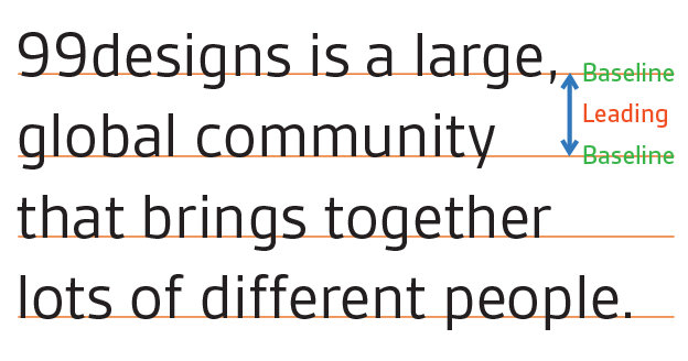
5. Line Spacing (Leading):
Proper line spacing, or leading, is crucial for readability. Aim for line heights that are 1.5 to 2 times the font size, providing enough space between lines to make reading comfortable. Adjust line spacing for headings and body text accordingly.

6. Measure (Line Length):
Pay attention to the line length, often referred to as “measure.” Avoid extremely long lines, as they can strain the reader’s eyes. Aim for 50-75 characters per line for optimal readability.
7. Contrast is Key:
High contrast between text and background colors is essential. Low contrast can make reading difficult and strain the eyes. Utilize tools like the Web Content Accessibility Guidelines (WCAG) to assess and improve contrast for accessibility.
8. Consistency is King:
Maintain consistency in typography across your website. Use the same fonts, font sizes, and styles for similar types of content. Creating a style guide can be immensely helpful in documenting your typography choices for easy reference.
9. Embrace White Space:
White space, or negative space, provides room for your text to breathe. Avoid cluttered layouts that overwhelm users. Adequate spacing around text and between elements enhances readability and aesthetics.

10. Accessibility Matters:
Always consider accessibility guidelines when selecting fonts and typography. Ensure that your text is easily readable for all users, including those with visual impairments. Use semantic HTML elements to structure your content for screen readers.
11. Test Across Devices:
Test your typography choices on various devices and browsers to ensure consistency and readability. Be mindful of how fonts render on different platforms and make adjustments as needed.
Branding and Personality:
Typography can be a powerful tool to convey your brand’s personality and values. The right font choice can communicate professionalism, friendliness, or creativity. Consider custom fonts for a unique brand identity but be cautious about their impact on page load times.
In conclusion, typography is a cornerstone of web design that can make or break your website’s success. By adhering to these best practices and considerations, you can create visually appealing, readable, and user-friendly web designs that effectively communicate your content and brand message. Remember that good typography is not just about aesthetics; it’s about enhancing the user’s experience and ensuring that your message is heard loud and clear on the digital stage.
