Color is a powerful tool in graphic design. It can evoke emotions, communicate messages, and create visual impact. Understanding color theory is essential for every graphic designer who wants to create compelling and visually appealing designs. In this blog post, we will explore the principles of color theory and how they can be applied in graphic design to enhance the effectiveness of your designs.
The Basics of Color Theory:
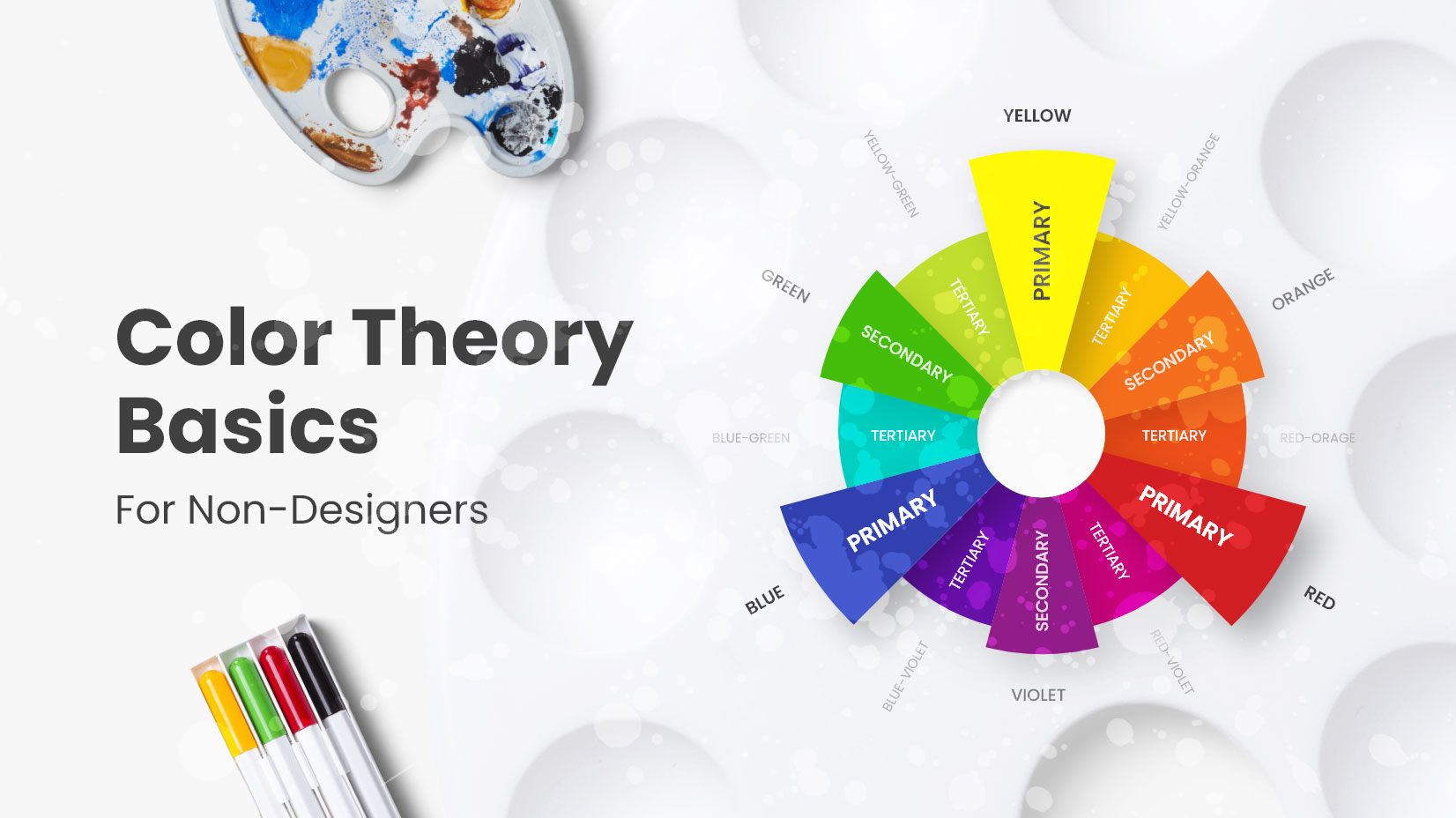
Color theory is the study of how colors interact and how they can be combined to create harmonious and visually pleasing designs. It is based on the color wheel, which consists of primary, secondary, and tertiary colors. Understanding the relationships between these colors is crucial in creating balanced and aesthetically pleasing designs.
The Psychology of Colors:
Colors have psychological associations and can evoke specific emotions and reactions in viewers. For example, warm colors like red and orange can convey energy and passion, while cool colors like blue and green can evoke a sense of calmness and serenity. Understanding the psychological impact of colors allows designers to strategically choose colors that align with the intended message and target audience.
Color Harmonies and Schemes:
Color harmonies refer to combinations of colors that are visually pleasing and harmonious. Some commonly used color harmonies include complementary, analogous, triadic, and monochromatic color schemes. By using these harmonies, designers can create a sense of balance and visual interest in their designs.
The Use of Contrast:
Contrast plays a vital role in graphic design as it helps create visual impact and hierarchy. By using contrasting colors, such as pairing light and dark colors or complementary colors, designers can make elements stand out and guide the viewer’s attention. Contrast is also essential for legibility, ensuring that text and important elements are easily readable against the background.
Color in Branding and Communication:
Colors play a significant role in branding and communication. Many well-known brands are instantly recognizable by their distinctive color palettes. Consistency in color usage across different design materials helps establish brand identity and fosters brand recognition. Additionally, different industries and cultures may have specific color associations that designers should consider when creating designs for specific purposes.
Color Accessibility:
Inclusive design is an important consideration in graphic design. Ensuring that color choices meet accessibility standards is crucial to make designs accessible to individuals with color vision deficiencies. Designers should pay attention to color contrast, provide alternative text for color-coded information, and consider using additional design elements to convey information.