In the ever-evolving world of design, staying current and creating eye-catching visuals is essential. One powerful tool that designers have harnessed to achieve modern and striking effects is color gradients. These subtle or bold transitions from one color to another offer a versatile way to add depth, dimension, and intrigue to your designs. In this blog post, we will explore the art of using color gradients for modern design effects.
The Magic of Color Gradients
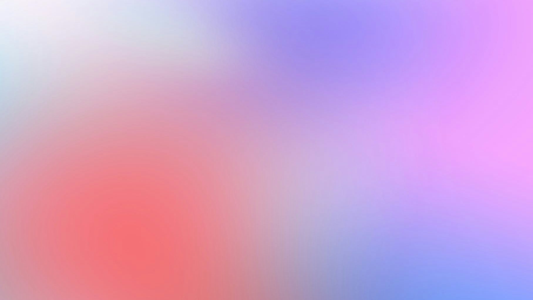
Color gradients, also known as color fades or ombre effects, involve the seamless blending of two or more colors. These transitions can be applied in various directions, angles, and styles, offering a wide range of possibilities for designers to explore.
Choosing the Right Colors
Before diving into the world of gradients, it’s essential to choose the right colors. The selection of colors can influence the emotions and messages your design conveys. Tools like Adobe Color Wheel and Coolors can help you find the perfect color combinations, whether you’re aiming for a harmonious and soothing effect or something bold and attention-grabbing.
Simple vs Complex Gradients
Gradients can be as simple as transitioning between two colors or as complex as using a spectrum of hues. The choice between simplicity and complexity depends on your design’s purpose. Simple gradients are elegant and subtle, while complex gradients can make a bold statement.
Direction and Angle
The direction and angle of your gradient play a significant role in determining the mood and visual impact of your design. Vertical gradients often convey stability and growth, while horizontal gradients suggest transition and change. Diagonal gradients can create a dynamic and energetic feel.

Transparency and Opacity
Experiment with the transparency or opacity of your gradient. Adjusting these factors can add depth, texture, and subtlety to your designs. It’s a great way to create unique effects and make your work stand out.
Layering and Blending
Overlapping gradients can produce exciting and unique results. Play around with layering gradients, change blending modes, or employ gradient maps to create a distinctive look. This can be particularly useful for creating abstract or artistic compositions.
Practical Applications
Now that you understand the basics of using color gradients let’s explore how to apply them effectively in modern design.
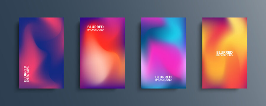
Backgrounds
Gradients can work wonders as background elements. They add depth and visual interest without overshadowing the primary content. Just ensure there’s enough contrast for readability and accessibility.
Icons and Buttons
Enhance icons, buttons, or call-to-action elements with gradients. These small additions can make them more eye-catching and interactive, encouraging user engagement.
Typography
Applying gradients to text can create a striking effect. However, readability is crucial. Ensure that the text remains easily legible by using contrasting colors and possibly adding a subtle gradient overlay.

Staying Relevant and Consistent
In the fast-paced design world, it’s essential to stay updated with the latest trends and seek inspiration from other designers’ work. Gradients have seen a resurgence in recent years, and trends in gradient usage continue to evolve. By staying current, your designs will feel fresh and relevant.
If you’re working on a brand project, maintain consistency in the choice of colors and gradients to reinforce the brand identity. This consistency will help create a strong visual association between the brand and its audience.
User Experience Considerations
While designing with gradients, it’s crucial to consider user experience. Ensure that your gradients enhance the design without compromising load times or causing distractions. A well-balanced gradient can enhance user engagement and satisfaction.
Experiment and Seek Feedback
Remember that using color gradients in design is as much art as science. Experiment, iterate, and adapt your choices based on the specific project and audience. Don’t hesitate to seek feedback from colleagues or potential users. A/B testing can help determine the effectiveness of gradients in achieving your design goals.
In conclusion, color gradients are a powerful tool in modern design, allowing designers to create visually appealing and dynamic effects. When used thoughtfully, gradients can add depth, visual interest, and a modern touch to your designs. So, go ahead and experiment with gradients, and let your creativity shine!