Typography, often seen as the art and technique of arranging type, is a design element that wields a silent, yet profound influence on visual communication. In the world of design, it’s more than just selecting a font; it’s about sculpting words into a visual masterpiece. This article delves deep into the captivating realm of typography and its pivotal role as a graphic element in design.
I. The Art of Font Selection
A. Choosing the Right Typeface
When delving into typography, one must begin with the cornerstone of font selection. It’s a journey into exploring the personalities of typefaces, an art form within itself. Fonts are more than just letters; they are the voice of your design.
- Exploring Typeface Personalities: Each typeface has a distinct personality. Serif fonts, with their embellished strokes, can exude tradition and formality. In contrast, sans-serif fonts embrace modernity and simplicity, reflecting a sense of clarity.
- The Versatility of Fonts: The world of fonts offers a spectrum of versatility. Some fonts boast a myriad of weights, styles, and variations, providing designers with a palette of choices to create visually captivating designs.
- Ensuring Legibility: No matter how stylish a font may be, legibility is paramount. Fonts should remain legible across various sizes and contexts, ensuring that your message is always clear and accessible.
B. Pairing Fonts Effectively
Typography often thrives on contrast and harmony, and the art lies in pairing fonts that evoke both. This is where the magic happens, and designers sculpt their design’s personality.
- Creating Visual Harmony: Effective font pairing isn’t merely about choosing two fonts that look nice together. It’s about creating a visual harmony that resonates with your design’s message and tone.
- Combining Serif and Sans-Serif Fonts: Merging the elegance of serif fonts with the simplicity of sans-serif can result in striking contrasts, offering a blend of classic and contemporary.
- Emphasizing Contrast: Contrast is a designer’s friend. Fonts of varying weights and styles can emphasize hierarchy, guiding the viewer’s eye and creating a clear and organized structure within your design.

II. Establishing Hierarchy
A. The Role of Typography in Hierarchy
Typography plays a pivotal role in establishing hierarchy within a design, guiding the viewer’s eye and signifying importance. It’s the designer’s tool to orchestrate information and direct attention.
- Guiding the Viewer’s Eye: Through carefully crafted typography, designers can guide the viewer’s gaze to essential elements within a design, ensuring that the message is received as intended.
- Signifying Importance: Font attributes like size, weight, and style act as visual cues. They signify the importance of specific content, differentiating headings, subheadings, and body text.
B. Playing with Font Attributes
The subtleties in font attributes can make all the difference in how a design is perceived. A skillful designer knows how to wield these attributes for maximum impact.
- Size Matters: Crafting Headings and Subheadings: Varying font sizes create a hierarchy of information. Headings demand attention, while subheadings provide context, guiding the reader through the content.
- Weight and Style Variations: Fonts offer an array of weights and styles. Bold, italics, and underlines can highlight key points, evoke emotions, and add depth to the design.
- The Magic of Italics and Bold: Italics can infuse a sense of emphasis and elegance, while bold can command attention. The judicious use of these styles can transform the way text is perceived within a design.
III. Typography as Art
A. Beyond Words: Typography as Art
Typography transcends its textual nature and transforms into visual art. It’s a canvas where words become shapes, images, and expressions of creativity.
- Exploring Typographic Art: Typography can be an art form in itself. Designers use words to create visual compositions, turning letters and characters into images that resonate with viewers.
- Incorporating Text into Shapes and Images: Through ingenious manipulation of type, designers merge text with shapes and images, weaving a narrative that’s both visual and textual.
B. Creative Text Manipulation
Typography isn’t confined to the horizontal. Creative designers venture into uncharted territory, using text to navigate curved paths and irregular landscapes.
- Text Along Curved Paths: By curving text along predefined paths, designers can create dynamic and visually engaging compositions, adding a sense of movement and flow to their designs.
- Irregular Typography for Impact: Breaking away from the conventional grid, irregular typography can disrupt expectations and create a lasting impact. Designers play with angles and arrangements to challenge the norm.
IV. Consistency for Cohesion
A. The Importance of Consistency
In the symphony of typography, consistency serves as the conductor, ensuring that every note and element plays in harmony. It’s about establishing a visual identity that’s recognizable and dependable.
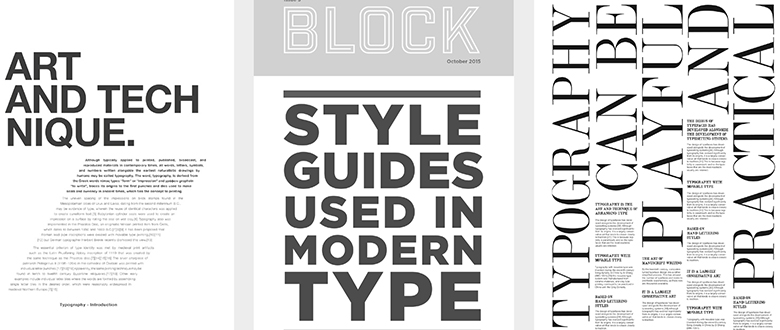
- Establishing a Typography Style Guide: Designers create style guides that outline fonts, sizes, and styles for various design elements. This document becomes the design bible, ensuring that consistency reigns supreme.
- Maintaining Visual Uniformity: Whether it’s a website, a print brochure, or a mobile app, consistency in typography ensures that the brand’s visual identity remains intact across different mediums.
B. Contextual Typography
Designers are versatile artists who adapt their craft to suit the context. Contextual typography is about tailoring fonts and styles to fit the medium and message.
- Adapting to Different Mediums: Typography for a website may differ from that of a print brochure. Designers adapt their typography choices to suit the medium’s unique requirements and constraints.
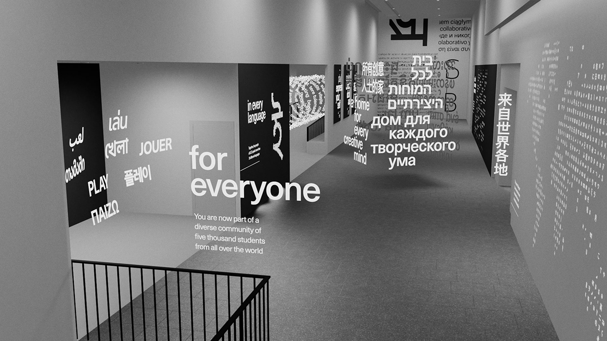
- Tailoring Typography to Specific Contexts: The context of a design matters. Typography for a corporate report will differ from that of a whimsical children’s book. The message, audience, and purpose dictate the typography choices.

V. Typography and Branding
Typography’s Role in Brand Identity
In the world of branding, typography plays a starring role. Custom fonts and meticulous typographic choices become the brand’s signature.
- Custom Fonts and Brand Recognition: Some brands go the extra mile by creating custom fonts that are exclusively theirs. These fonts become synonymous with the brand, fostering recognition and loyalty.
- Expressing Brand Personality through Typography: Typography isn’t just about aesthetics; it’s about personality. Brands use typography to convey their values, tone, and ethos, establishing a unique identity in the market.
VI. Embracing Experimentation
The Art of Typography Experimentation
While consistency is essential, designers also understand the value of pushing boundaries and breaking free from conventional typographic norms.
- Pushing Boundaries with Fonts: Designers experiment with unconventional fonts, pushing the boundaries of legibility and style to create unique and memorable designs.
- Creative Layout and Effects: Typography isn’t confined to linear layouts. Designers explore creative layouts and effects to breathe life into their designs, capturing attention and sparking curiosity.
- Breaking the Rules for Innovation: Sometimes, innovation thrives in rule-breaking. Designers aren’t afraid to challenge typographic conventions, creating fresh and daring visual experiences.
In the realm of design, typography is an ever-evolving art form. It’s a language that transcends words, speaking to our visual senses. The possibilities are limitless, and the mastery of typography as a graphic element is a journey that promises endless creativity and innovation. It’s not just about fonts; it’s about sculpting messages, emotions, and stories into visual masterpieces that captivate and inspire. Typography is the silent artist behind the world’s most compelling designs, and mastering it is the key to creating design magic.