Typography is a captivating art that transcends the mere arrangement of letters; it serves as a powerful tool in design, shaping the user experience, evoking emotions, and conveying the intended message to the audience. Among the numerous factors that influence typography, two stand out as the key pillars of visual impact: scale and proportion. In this blog post, we will delve into the significance of scale and proportion in typography design, exploring how they can elevate the aesthetics and effectiveness of your designs.
The Importance of Typography in Design:
Typography is the cornerstone of design, playing a pivotal role in establishing the tone, personality, and overall appeal of a project. By carefully selecting typefaces, designers can evoke excitement, elegance, or formality, making typography an indispensable element in building brand identity and effectively communicating information.
The Impact of Scale and Proportion on Typography:
Scale and proportion are the unsung heroes of typography design, wielding the power to guide the viewer’s eye, create visual hierarchy, and infuse a sense of harmony into the composition. By skillfully employing these elements, designers can strategically direct attention to specific elements, emphasize key messages, and improve the overall readability of the content.
Understanding Scale in Typography:
Defining Scale in Design:
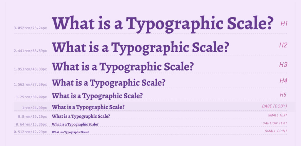
In typography, scale refers to the relative size of different typographic elements within a design. It involves determining which elements should assume a larger-than-life presence, instantly capturing attention, and which should take on a smaller role to complement and support the primary content.
Scale as a Tool for Visual Hierarchy:
Visual hierarchy is paramount in typography design, enabling designers to prioritize information and guide readers through the content effortlessly. By implementing varying font sizes, designers create a clear hierarchy, ensuring that headlines, subheadings, and body text coexist harmoniously, allowing the audience to navigate the information with ease.
Exploring Large-Scale Typography: When and How to Use It:
Large-scale typography commands attention, making it an effective technique for emphasizing critical information or creating a sense of grandeur. However, designers must tread carefully to ensure that large-scale typography enhances the overall design without overwhelming the viewer or diluting the intended message.
Small-Scale Typography: Making a Big Impact with Less Space:
While large-scale typography makes a bold statement, small-scale typography can be equally impactful, particularly in limited spaces or minimalistic designs. When executed thoughtfully, small typefaces can communicate elegance and sophistication, amplifying the overall aesthetic appeal.
Proportion in Typography Design:
The Role of Proportion in Visual Harmony:
Proportion is the art of achieving visual balance and harmony within typography. It involves maintaining consistent relationships between letterforms, line spacing, and margins. When the proportions are perfectly balanced, typography becomes visually pleasing and effortlessly readable.
Golden Ratio and Typography: Applying Mathematical Perfection to Design:
The Golden Ratio, a divine mathematical concept present in nature and art, also finds its place in typography design. By incorporating the Golden Ratio’s proportions, designers create visually pleasing and aesthetically balanced typography that resonates with the human eye on a subconscious level.
Experimenting with Asymmetrical Proportions: Breaking the Norms for Unique Designs:
While adhering to traditional proportional guidelines is safe, embracing asymmetry can lead to unique and eye-catching typography designs. Unconventional proportions add a touch of creativity and originality to the typography, captivating the audience with an unexpected visual language.
Creating Visual Impact with Scale and Proportion:
Using Contrast to Command Attention: Large vs. Small Typefaces: Contrasting scale, such as pairing large headlines with smaller body text, creates a striking visual effect that draws attention to specific elements. This interplay of contrasting sizes emphasizes key messages and adds dynamism to the design, driving home the intended message with finesse.
Emphasizing Key Messages: Scaling Techniques for Emotion and Focus:
Through skillful manipulation of scale, designers can infuse typography with emotions, making it an integral part of the storytelling process. Bold and large typography can evoke urgency or excitement, while delicate and small typefaces can convey a sense of intimacy and subtlety, resonating with the audience on a deeper level.
Playful Typography: Utilizing Dramatic Scaling for Artistic Expression:
Typography isn’t just about function; it is also an art form that allows designers to express creativity and push boundaries. Through dramatic scaling, designers can create visually stunning and playful designs, transforming typography into a masterpiece that leaves a lasting impression.
Typography for Various Mediums:
Responsive Typography for Digital Design: Ensuring Readability on All Devices:
In the digital era, responsive typography is critical to ensure optimal reading experiences across various devices and screen sizes. Designers must consider how typography adapts to different resolutions while maintaining legibility and visual appeal, providing a seamless reading experience for all users.
Print Design and Typography:
Scale and Proportion for Effective Communication: In print design, designers have precise control over scale and proportion, enabling them to create balanced and aesthetically pleasing typography that effectively communicates the intended message. The beauty of print lies in its tangible nature, and typography contributes significantly to the overall visual impact of printed materials.
Logo Design: Scaling Typography for Brand Recognition:
When incorporating typography into logos, designers must carefully consider how scale and proportion influence brand recognition. The typography must be scalable to ensure the logo remains identifiable across various applications and sizes, serving as a visual representation of the brand’s essence and values.
Achieving Readability and Aesthetics:
Finding the Perfect Line Length:
Balancing Readability and Visual Appeal: The length of lines in a paragraph directly impacts the readability of the text. Striking the right balance between line length and font size enhances the reading experience, preventing visual fatigue, and promoting seamless comprehension of the content.
Leveraging White Space:
Enhancing Typography with Proper Spacing: White space, or negative space, plays a pivotal role in typography design. Providing adequate spacing between elements improves readability, allows the typography to breathe, and creates a sense of elegance and sophistication in the overall design.
The Influence of Typeface Choice on Scale and Proportion: Serif vs. Sans-Serif:
The choice between serif and sans-serif typefaces significantly influences the overall design. Designers must carefully consider the personality of each typeface and how it complements the intended scale and proportion, ensuring a harmonious blend of form and function.
The Psychology of Typography: Conveying Emotions through Typography:
How Scale and Proportion Impact Perception: Typography has a profound psychological influence on the reader, evoking emotions and shaping perceptions. By understanding the psychological implications of scale and proportion, designers can align typography with the intended message, evoking the desired emotional response from the audience.
Building Trust and Authority: Typography Choices for Credibility:
Typography can play a crucial role in establishing a brand’s credibility and authority. Consistent and well-balanced typography conveys professionalism and reliability to the audience, fostering a sense of trust in the brand and its offerings.
Scaling for Accessibility:
Inclusive Design: Scaling Typography for Different Audiences:
Inclusive design ensures typography remains accessible to all users, including those with visual impairments. Adapting the scale and proportion to accommodate different needs enhances the overall user experience, promoting inclusivity and making the content accessible to a broader audience.
Considering Accessibility Guidelines: Ensuring Readability for All Users:
Designers must adhere to accessibility guidelines to make typography accessible to a broader audience. These guidelines encompass factors such as font size, contrast, and spacing, promoting readability for all users, regardless of their abilities.
Best Practices for Scaling Typography:
Establishing Visual Hierarchy:
Combining Scale and Proportion for Clear Communication: By thoughtfully combining scale and proportion, designers create a clear and intuitive visual hierarchy that guides readers effortlessly through the content. A well-established hierarchy ensures that the most critical information stands out while supporting content complements the overall message.
Consistency is Key: Maintaining Balance Across Different Typography Elements:
Consistency in scaling and proportion throughout a design fosters a sense of coherence and unity. Ensuring all elements work harmoniously together enhances the overall aesthetic appeal, making the design visually appealing and harmonious.
Testing and Iteration: Refining Scale and Proportion for Optimal Results:
Design is an iterative process, and typography is no exception. Regular testing and feedback from users can help designers refine their use of scale and proportion, ultimately achieving the desired impact and effectiveness. Iteration allows designers to fine-tune typography, ensuring it aligns seamlessly with the overall design and resonates with the target audience.