The selection of a suitable typeface holds immense importance in design, as it significantly impacts the aesthetics and effectiveness of communication. The purpose of this article is to highlight the significance of choosing the appropriate typeface for your design projects, considering the various factors that contribute to successful typographic choices.
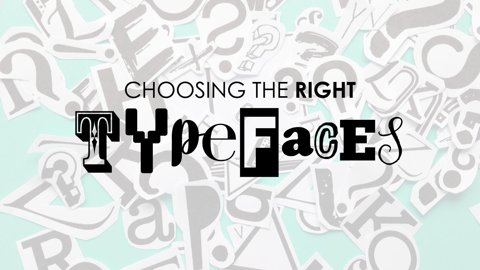 Understanding Typefaces:
A typeface is a set of letterforms and characters with consistent design attributes. It encompasses the visual representation of a particular style of typography. Differentiating between typefaces and fonts is essential, as a typeface refers to the overall design, while a font refers to a specific variation or style within that typeface family. Typefaces play a crucial role in conveying emotions and messages, as they have distinct visual characteristics that evoke specific moods or associations.
Exploring Typeface Categories:
There are several categories of typefaces, each with its unique characteristics and best uses. Serif typefaces feature small decorative strokes, or serifs, at the ends of characters. They exude a sense of tradition and are commonly used for long-form text, such as in books or newspapers.
On the other hand, sans serif typefaces have a clean and modern appearance, lacking the decorative strokes. They are versatile and often used for digital interfaces and contemporary designs. Display typefaces are highly decorative and eye-catching, suitable for headlines or attention-grabbing elements. Script typefaces imitate handwriting, adding a personal and elegant touch to designs. Novelty typefaces are playful and unconventional, used sparingly for specific design purposes.
Considerations for Selecting a Typeface:
When selecting a typeface, it is crucial to consider various factors. Defining the project goals and understanding the target audience are essential steps in narrowing down suitable options. Different typefaces evoke different emotions and carry specific connotations, making it necessary to align the typography with the intended message and brand identity.
Evaluating readability and legibility requirements ensures that the chosen typeface is clear and easily readable in the desired context. Additionally, harmonizing typography with other design elements, such as color palette and imagery, contributes to a cohesive and visually appealing composition.
Establishing Visual Hierarchy:
Visual hierarchy plays a fundamental role in effective design composition. By utilizing typeface attributes, such as weight, size, and style, designers can establish a clear hierarchy that guides the viewer’s attention. Headings and subheadings can be differentiated through the use of bold or larger fonts, while body text maintains a smaller size and regular weight. This differentiation creates a visual structure, making the content more scannable and engaging.
Assessing Legibility and Readability:
Legibility and readability are crucial aspects of typeface selection. Legibility refers to the ease with which individual characters can be recognized, while readability encompasses the overall comfort and fluency of reading a body of text. Factors such as x-height (the height of lowercase letters), spacing between characters, and letterforms influence legibility. Considering the reading conditions and medium, such as print or digital, is also essential in ensuring optimal legibility. Testing different type sizes and weights can help identify the most readable option for a specific context.
Pairing Typefaces Effectively:
Pairing typefaces is an art that involves selecting and combining complementary fonts to create contrast and harmony. The contrast between typefaces can be achieved through variations in style, weight, or characteristics. For instance, pairing a serif typeface with a sans serif typeface can create a visually appealing juxtaposition. Understanding typeface compatibility and contrast principles enables designers to select typefaces that work harmoniously together, enhancing the overall design. Exploring various font pairing techniques and examples can provide inspiration and guidance for effective combinations.
Typography and Branding:
Typography plays a crucial role in brand identity and recognition. Aligning typography with brand values and personality ensures consistency and reinforces brand messaging. The selection of a typeface that resonates with the brand’s identity contributes to a cohesive visual representation across different brand communications. Maintaining consistency in typography, such as using the same typeface or typeface family, helps establish a strong and recognizable brand presence.
Typography and User Experience:
Typography has a significant impact on user experience, especially in digital design. Choosing appropriate typefaces and optimizing legibility for different devices and screen sizes is essential to ensure a seamless and enjoyable reading experience. Considering accessibility guidelines and requirements, such as sufficient contrast between text and background, enhances usability for all users, including those with visual impairments.
Customizing Typefaces:
Font customization offers opportunities for designers to tailor typefaces to their specific design needs. However, it is essential to proceed with caution to maintain readability and legibility. Exploring font customization options, such as adjusting letter spacing or modifying specific characters, can add uniqueness to a design while preserving the integrity of the typeface. It is crucial to consider the intended context and audience when customizing typefaces.
Resources and Tools for Typeface Selection:
Numerous resources and tools are available to aid in the selection of typefaces. Online platforms provide opportunities to explore and test different typefaces, offering previews and information on characteristics and recommended uses. Typeface libraries and foundries offer a wide range of options for both commercial and personal projects. Tools for comparing and pairing typefaces facilitate the process of finding compatible combinations and creating harmonious typography.