Typography is an art form in itself, and it plays a pivotal role in the world of print design. From conveying information to evoking emotions, typography is the bridge that connects your message to your audience. In this blog post, we’ll explore the essential tips for using typography effectively in print design to ensure your message is not only seen but also heard loud and clear.
1. Choose the Right Typeface:
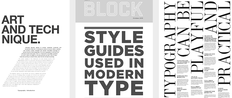
The journey into effective typography begins with selecting the right typeface or font. Your choice should align with the message you want to convey. Serif fonts like Times New Roman project tradition and formality, while sans-serif fonts like Helvetica offer a modern, clean aesthetic. Decorative fonts can be exciting but use them sparingly, ensuring they enhance rather than distract from your design’s core message.
2. Maintain Readability:
No matter how beautiful a font may be, if it’s not legible, it’s not effective. Ensure that your text is easily readable by choosing appropriate font sizes. The ideal size depends on factors such as the typeface and context, but generally, aim for 9-12 points for body text. Adequate line spacing (leading) and letter spacing (tracking) are equally vital to prevent overcrowding and improve legibility.

3. Hierarchy and Emphasis:
Typography helps create a visual hierarchy within your design. Use font size, weight (boldness), and style (italic, underline) strategically to guide the reader’s eye. Key elements, like headlines and subheadings, should stand out, providing a roadmap for your audience to navigate your content effectively.
4. Consistency is Key:
To maintain a cohesive look in your design, stick to a limited set of typefaces. Typically, using 2-3 typefaces is sufficient for most projects. Consistency in text alignment (left, right, center, justified) and other formatting details add to the overall professionalism of your design.

5. Color Considerations:
Color can be a powerful tool when combined with typography. High-contrast text, such as white on black, can be attention-grabbing, while low-contrast text, like light gray on white, offers subtlety. Ensure there’s enough contrast between text and background colors to maintain readability.
6. Whitespace and Alignment:
Whitespace is not wasted space; it’s a crucial aspect of your design. Adequate margins and padding provide breathing room, preventing your design from feeling cluttered. Consistent alignment of text and other design elements contributes to a polished and harmonious look.

7. Grid Systems:
Grid systems help maintain a structured layout in your design. They assist in aligning text and graphic elements, resulting in a balanced and visually pleasing composition. Grids are your secret weapon for maintaining order and coherence.
8. Consider the Audience:
Think about the preferences and expectations of your target audience. A design intended for a corporate audience may require a different typography approach than one aimed at a younger demographic. Tailoring your typography to your audience’s tastes enhances the effectiveness of your message.
9. Legibility Over Creativity:
While creativity is fundamental in design, never sacrifice legibility for the sake of artistic expression. The primary goal of typography is to convey information effectively. If your audience can’t read the message, your design loses its purpose.
10. Proofread and Edit:
Before finalizing your print design, proofread all text for spelling and grammatical errors. Typos can undermine the professionalism of your work. A final check can make the difference between a design that communicates flawlessly and one that leaves a poor impression.
11. Test and Iterate:
Printing a test copy allows you to evaluate how your typography looks in the physical format. Make adjustments as needed before moving forward with mass production. The tactile experience of print can reveal details that may not be evident on a screen.
12. Stay Updated:
The world of typography is ever-evolving, with new trends and best practices emerging regularly. Staying current with the latest developments ensures your designs feel fresh, relevant, and engaging.
Typography is not just about choosing pretty fonts; it’s about effective communication. When wielded skillfully, typography can elevate your print design, making it not only visually appealing but also a powerful messenger of your message. Keep these tips in mind as you embark on your next print design project, and watch your message come to life on the page.